Empowering Working Moms to Regain Control of our Busy Lives
We provide tailored tools, strategies, and mindset coaching to help you feel more organized, confident, and in charge of your day-to-day routine. By focusing on both practical solutions and the power of a positive mindset, we guide you on a journey toward balance and success, making your daily adventures more manageable and fulfilling.

Sign up and Save
Get 15% off your first order!
What Client Our Says About Us

More Peace, Less Stress
My days used to feel chaotic, but now I have structure and clarity. Thanks to Our Learning Adventures, I feel more at peace, less overwhelmed, and actually excited about my daily routine. I can’t recommend them enough!
- Amanda R.
A Game Changer
Balancing work, home, and family felt impossible—until I started using the tools and strategies from Our Learning Adventures. Now, I feel confident managing my time and setting boundaries. It’s a total game changer!
- rachel k.

Life-Changing Organization!
Before discovering Our Learning Adventures, I was drowning in to-do lists and overwhelmed by my schedule. Now, I feel in control of my time, more present with my family, and less stressed about the daily juggle. The tools and mindset shifts I’ve learned are life-changing!
- Jessica m.
Latest Blog Posts
Project 6: Stationary
Description:
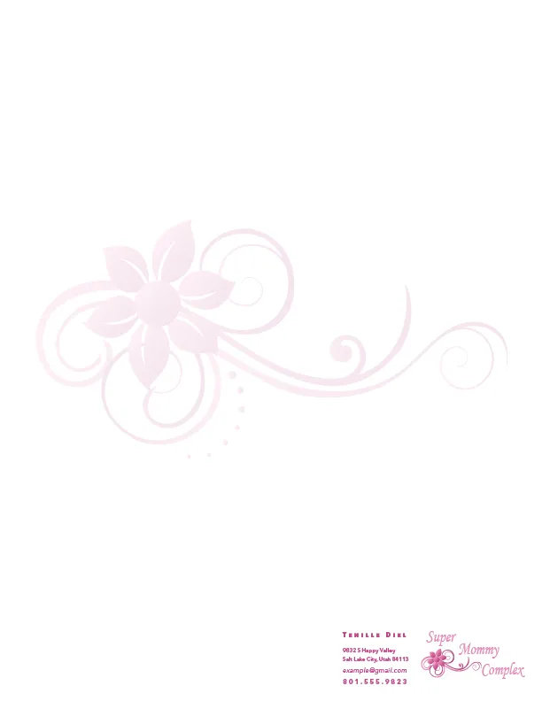
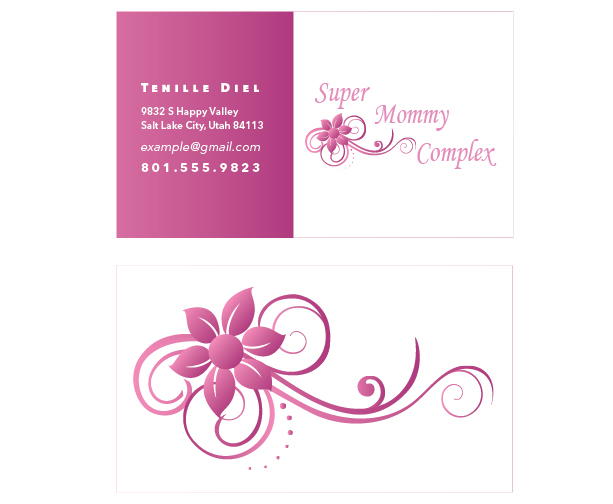
A Project where we had to create a logo and then design a business card and letterhead to match that logo.
Process (Programs, Tools, Skills):
I started this project by sketching out some designs for the new logo I needed to create. I wanted to create a logo for a website that I created, but had never taken the time to make a logo for. After I came up with a general plan that I liked in my sketches, I started creating my logo using the Adobe Illustrator software. I came up with the font I wanted to use for the project and then I designed a nice flower and flowing lines to go with it. I was trying to create something calming and beautiful. After I made the logo, I sketched out some ideas for the business card and letterhead. I then used Adobe Indesign to create the business card and letterhead, using the logo I created in Illustrator and the ideas from my sketches. I made sure to use the logo on both pieces of stationary, and tried to keep the text and elements the same on all of the stationary items. I used my flower and line graphic on the back of the business card to unify and add interest to the card, and I added a watermark of that same design in the middle of the letterhead page. I struggled the most with figuring out the text color, size, and font. It is difficult to find a balance between readability, and a size that didn’t stick out and look awkward. I then printed out my stationary pieces and found that I had the opacity way too low for printing. The first couple of times I printed the letterhead, the watermark didn’t show up at all. I eventually changed the opacity from 6% to 13% so that it would show up when printing. I am pleased with the end result and will now work on redesigning my website with this new logo that I created.
Message:
A logo for mother’s and all the hard work they put in. The colors and design is meant to be calming and beautiful.
Audience:
Mothers and those that are wanting to find information on parenting.
Top Thing Learned:
That it is important to be consistent when creating stationary, so that people can easily tell them belong together. I also learned that it is important to make sure that the text is easy to read and that you include all of the necessary information for people to contact you.
Color scheme and color names:
Monochromatic- Violet
Title Font Name & Category:
Monotype Corsiva – Script
Copy Font Name & Category:
Avenir Next LT Pro – Sans Serif
Related
About Us
We help working moms feel more organized, confident, and in control of their day-to-day life through effective use of tools and learning the importance of giving themselves grace and understanding the power of mindset.
Contact Us
Email: [email protected]
Copyright© 2025 Our Learning Adventures - All Rights Reserved.
Facebook
Instagram
Pinterest